Monday, March 26, 2012

Ads Commentary, Adobe Illustrator and Upcoming Projects

This weeks update relates to making commentary about certain types of ads. The point is to
find one example for each heading.The list of requested types of headings are as follows;
1. Shock
2. Disruption
3.Engagement
4.Empathy
5.Humor
6.Surreal/Weird
7. Nostalgia (not an old poster, but one that uses nostalgia to seel a modern product)

  The first example as it relates to shock is an ad for an erotic accessory store. The is predicated on the saying "Make love, not war.", but turns it into a pun. It ties it into their store's product line. The ad is shocking with it's use of sexual imagery. The work done in merging the dildo with the gun is well done, though in my opinion it comes off as crude and overpowering. It's simple enough, yet I feel like this ad could be been approached more subtly without being too ambiguous. 
     For the disruption example I decided to comment on this ad in particular. It is called  
"Ninseikan Karate School: vs Porcupine" and it's an advertisement for a karate school. I like how it catches my eye. It really threw me for a loop for how random it seemed at first. It takes on favored Japanese archetypes of the over sized monster and it gives the impression that the karate student is taking on a formidable opponent, but it can initially appear vague in it's theme. Perhaps they could photoshop a karate band around the porcupine's head to make the theme seem more tied into karate.
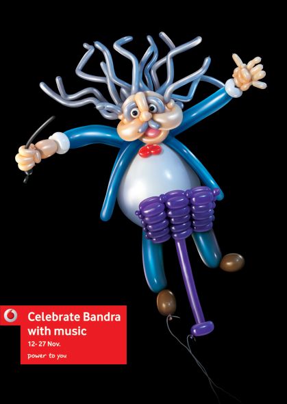
 For a good example of an engaging piece I chose this advertisement. It's advertising Celebrate Bandra, which is a cultural festival. I find the use of color to be very intriguing. It's eye grabbing because of the vivid color that is contrasted against a black background. The use of color also ties into the theme of a cultural festival because color implies diversity. Diversity is a big part of cultural festivals.


       The ad I chose as an example of empathy was this ad for the Institute of Mental Heath. It's theme in particular is of anorexia. This ad brings to attention a serious issue by displaying a picture of a severely emaciated young girl. The ad is obviously attending to garner empathy from it's viewers by associating the picture to what we normally think when faced with an existentially nerve racking issue. We can feel the deep visceral emotional pain of the young woman as she struggles to fight her feelings of bitterness towards her self image. As a result we are necessarily moved to pity this girl even if we can't see her face. I emphasize with her condition because I can relate to having a culture judge who you are  because you fail to meet their expectations. The gray scale definitely sets the mood to accentuate the downtroddeness of the girl.


         The next example is an advertisement that uses humor. I chose this ad for noise canceling headphones because it conveys humor in a way that is both witty and relevant to the nature of their product. Mimes are suppose to be silent, thus, you would not hear them. The headphones are suppose to cancel out any and all noise around you so that you will not be disrupted. The mime ties into the effectiveness of the product. The ad is cleverly designed and is eye grabbing. Whose eye wouldn't be caught by a baby painted up like a mime? 
An example of a surreal advertisement is this awesome homage to the surrealist painter Salvador Dali for Volkswagen. This takes advantage of visual elements unique to Dali, including melting objects like the gas gauge hanging on the tree.  Others include deflated objects hung on sticks, repeating patterns of sequenced images that are slowly morphing and disproportionate figures. All of these objects relate to Volkswagen in some way, shape or form. The disproportionate figure is a mechanic and the deflated object is a gasoline tanker. Interestingly enough they attempt to make sense out of a seemingly absurd juxtaposition of real objects  portrayed in a surreal way. Their slogan is that the Polo BlueMotion has "Absurdly low consumption". This implies that the consumption of the car is as absurd as the advertisement. This imitation of Dali is captivating to look at. It strikes me as odd looking, yet strangely beautiful.

     Last, but certainly not least we have an example of a nostalgic advertisement and what other kind of example could we use other then the "This is your brain on drugs ad"? This advertisement among others was part of a string of ads that they showed in the 90's. The point of these ads were to keep young teens from using drugs by the use of an analogy; an egg  and a frying pan. The pan is suppose to symbolize the drug and the egg frying is suppose to be your brain. The effect the drug has on you is not necessarily always compared to frying. The most famous rendition of these types of ads had to do with a commercial they played on television. In that rendition a young woman, uses this symbolism and proceeds to smash the egg under the frying pan. She then starts to smash the dishes and everything around her while telling the audience that this is your life on drugs; your relationship with your friends, your family and irrevocably your relationship with the drug itself.  She then ends her polemic with the phrase "Any questions?". They attempt to press you into realizing that you should stay away from drugs if you don't want that to happen to you. Even though this is the most famous rendition of the campaign, they also used a string of other media outlets including magazine advertisements, and billboards. The picture I have above is a picture used in magazines for this campaign. Much of the same analogy is used along with the phrase "Any questions?" at the end of the ad. The advertisement's analogy comes off clear, concise and to the point. The concept is simple, the design works for the theme and the message is powerful. This is why it got so much attention for it's time and while it's still remembered as a nostalgic advertisement.


Along with this critique I was instructed to work on a tutorial that talks about how to trace in illustrator. I decided to do the tracing of a character drawing that I am making for my other class "Video Game Design". The picture came out looking decent for the most part. The program turned out to be easier to use then what I previously thought. Finally I will wrap this up by summarizing the things that I have to do for next week. I have another tutorial that I must complete, which ties in both adobe photoshop and illustrator. Along with that, I also have a project due in April. The upcoming project is a poster redesign project. I have to make my own poster of a popular movie. I'm suppose to change the theme. I could make a minimalist version of a slasher movie, or perhaps even a German Expressionist version of a popular contemporary film. I have to make four different types of redesigned posters. Updates for how I'm doing for these projects are on the way.


Saturday, March 17, 2012

Finished Magazine Project and Upcoming Pieces


     I apologize for the late update. I wanted to make sure I had pictures of the project that I'm posting for the update. The project I have done what was completed this week was a magazine that I designed. I designed a cover page which was mounted on a 11X17 piece of foam core. Along with that I created a table of contents that spanned two pages take up an 11X17 that was mounted separately onto another piece of foam core of approximately the same size. Last I created and article section that spanned two pages that occupied a space of 11X17 that was mounted on yet another piece of foam core. The theme of the magazine was a sort of joke magazine for barbarians. It is no surprise that the name of the magazine is called, "Barbarian". I put on grease paint for the pictures that I took of myself. The profile pic I made for the cover seemed appropriate for the feel I wanted to get. The table of contents background was a background that I created from acrylic paint on masonite board. I wanted to get a sort of layered, crude, cracked blood appearance, with fresh splatters at the front of it. I used a desdemona typeface to go along with the table of contents. I used a bloody text for the cover logo. Finally I created the article page with a photo that I took of myself, with my back against a palm frond. The section was titled "The Vacationing Barbarian". This was my attempt at being ironic in that you would not expect a barbarian go on vacation, much less create a magazine. I boxed in the title with a few gradients and some bars to make it similar to what they would do with table of contents pages in insular manuscripts that were created in the Medieval Ages. On the second page I put the accompanying text with pictures I boxed in white to look like polaroids. When I presented the critic was mainly positive, except that the third section did not quite fit along with the theme in the same way the cover and table of contents did. I was generally satisfied with my work though. For next week I have a presentation I have to do on David Carson and I have been assigned my next big project. The upcoming project is not too bad, but it requires some deliberation on my part. The project simply put is to remake a movie poster in any alternative style that I see fit. For example I could do a minimalist version of a Tron poster. I'm required to do four versions of  a chosen poster. It could be of 4 different movies or 4 different version of the same movie. I can redesign the poster however I chose, as long as it recontextualizes the meaning of the film. See you next week.

Saturday, February 25, 2012

Projects update


     Two weeks before I had finished a magazine cover I had created in line with the tutorial I was assigned and had followed. I got the picture of a photo I had taken of myself with grease paint. Looking back at the picture it reminded me of how the marines look with camouflage. Though amusing, it gave me an idea for the title of the magazine. I named the title of the magazine Marine to go along with the picture. I used several gradients with a stroke effect in Adobe Indesign to create a backing for the text over it. I was generally pleased with the effect it gave the finished work. It looked very much what you'd expect from a magazine. This week we presented our typefaces mounted on foam board with dimensions of 11X17. I created three typefaces; a contoured, rounded off typeface in copper wire, a block lettered typeface in ripped up paper covered in acrylic paint, and a wire like typeface made of chocolate mixed with whipped cream in coffee. I personally found these mediums both aesthetically appealing and fitting to the design of each typeface. I got the effect I wanted out of all of them except for the copper wire typeface. The design of the typeface came out fine, but I wanted to create a sort of homage to the original arcade version of Donkey Kong by having the letters situated between the platforms  like in the game, from which  copper wire Donkey Kong would be barrels. The next assignment we were given after the presentations involves redesigning a magazine. It requires modifying the design of the cover, the table of contents, along with two pages of the first opening article. When I have done the magazine project, I'll have an update posted along with things we have done that week.

Friday, February 24, 2012

Typography Critique

                                                                 Example #1
                                                                     Example #2
                                                                       Example #3
Example #4
                                                                       Example #5
  The post for the bad and good typography is going up with this weeks post as it took longer to do then anticipated. The examples of bad typography I have posted include the the 5 examples above. Examples 1,2,4 and 5 all suffer from one bad flaw of typography; they are generic. Other then the use of color, the styling of the font is pretty similar and lacks expressiveness. The content of the typography is even more lacking. The title of the nail salon is nail colors, the name for the karate dojo is karate and the name of the dentistry is dentist. They don't give themselves a title which would distinguish themselves from anybody else. It similarly would not get Denny's any publicity if they simply called themselves restaurant and then had a typography they used in that logo that did not come across as unique.  Example 4 merely uses a bubbled text overlapped by another text in red to catch the attention of the passing drivers. The overlap obscures the title in a way that may come across as aesthetically unappealing. The use of rounded edge text seems very over abused in local advertisements almost as much as Helvetica is nationally, almost as if it's a fallback choice for those that can't make their own typeface. Example number three also comes across as unappealing as what looks very much like Times New Romans; another default text. Though I find Times New Roman to be appealing in regards to typeface as it is applied in communications and perhaps even used in articles, I find it unappealing when applied to commercial logos. The color is also neutral and unengaging.
                                                                         Example #1
                                                                         Example #2
                                                                       Example #3
                                                                         Example #4
 Example #5
      The next five are examples of what I believe to be good typographies. Example 1 is very expressive in that it is stylized to fit with the theme, which is fast food orientated toward poultry. The cursive typeface is aesthetically engaging, but it is clear and legible. The C in particular stands out from the rest, stylized like a chicken, but simplistic and minimalistic in its design. Example 2 is also very expressive as the first in that the design of the typography fits with the content of the title, "The Blue Monkey...” The Blue Monkey text is styled like stalks of bamboo, which complements well with the silhouette of the blue monkey. The block like text of example 3 is subdued enough so that the icon in the middle draws the viewer in, yet goes well with the overall presentation. This has been an effective marketing technique for Starbucks, as the icon alone is world renown in its association to the franchise by all who see it. Like McDonalds golden arches, there is no mistaking what this typography represents when you see it. Example 4 also has complimentary aspects of its design, both in its use of typeface and of its use of iconography. The Einstein bros in the middle draws the viewer's eye in at first. The differentiation of the color of the bagels they are holding across from their outstretched arms  arms brings one's attention to those objects and then around the circle of color surrounding them, which forms another bagel like shape. The thickness and color of the black typeface contrasts enough to stand out, but not so much that it is overpowering.One's attention is drawn to the bold typeface and then the thin typeface between Einstein Bros on the top and the word bagels on the bottom. Lastly number 5 seems to me to  represent good typography in it's use of the bell, which goes well with the content of the name of the franchise in a way that is unique to it's marketing alone. The purple typeface with the white outline gives it a design that helps it stand out, especially at night when these displays are glowing. This plays well into their marketing campaign as many of their low prices are offered at midnight. That's it for the bad vs. good examples of typography. A post for this week's general update about what I've done in Graphic Design so far and the projects I've been working on so far will be posted either later today or tomorrow. See you then!

Saturday, February 18, 2012

Typeface Project and Other Things

     This week we have been watching videos on typeface and it's social impact, particularly the Helvetica, a sans-serif typeface developed in 1957 by Swiss typeface designer Max Miedinger with Eduard Hoffmann. It's impact is marked by it's significance of being neutral or at least coming off subjectively to the viewer as being neutral. It has in many respects been a default for many commercial typeface and advertisements. It was mostly for educational purposes that we watched this, but secondarily because of the typeface project we were assigned. We are required to create a three types of typeface, each hand made, and each using a different medium. I had decided a week prior to use coffee for one, copper wire for another, and painted paper for the last. The finished photos shall be printed out 11X17 and mounted unto foam board. Along with this project I am required to take photos of five examples of good typography and five examples of bad typography and post them up on my blog. I should have that posted up on my blog by tomorrow.

Saturday, February 11, 2012

First Tutorial and Upcoming Magazine Cover


     This week we were expected to post up our finished work according to the tutorial we followed on a template for a template we were experimenting with  in Adobe Indesign. I had made some modifications, being that we were expected to make our own design that was to some degree based off that template. I modified the content of the article along with the picture, but all in all the design was not fundamentally altered in any serious way. In class, two classmates did presentations on two very influential graphic designers. The first was  Adrian Frutiger (born May 24, 1928 in Unterseen, Canton of Bern)  a typeface designer from Switzerland. He is best known for a realist sans-serif typeface called Univers. The other was Max Huber (1919–92) was an influential Swiss twentieth century graphic designer. Most of the work he did was in Italy. The job puts him in contact with the post-war Italian intelligentsia:Cesare Pavese, Natalia Ginzburg, Elio Vittorini, Franco Fortini, Ettore Sottsass, Achille Castiglioni and Albe Steiner. His typefaces were known to be very abstract and minimalistic. After the presentation we discussed the next homework assignment which will be creating a magazine cover through a tutorial that we are directed to follow.  Posts for that when I'm done are on the way.

Saturday, February 4, 2012

Graphic Design update: Brief Photo-Typo Assignment


Hey guys! So, as of the last couple of weeks we have been diligently been working at finishing the assignment given. The assignment was to capture photographic images which are representative of the typographic characters, numerals, & associated symbols. We can do all upper case or all lower case letters or a mixture of the two. The challenge is to create 45 images; 26 letters (A-Z)  - 10 numerals (0-9) - 9 Symbols.
This was part one of that brief photo-type assignment. The second part is to photo capture signages, which are  industrial/commercial/craft based typography. The goal of this is to capture 15 types of these signages.  For the 1st part of the project I looked in my house for found objects and projections that looked like any sort of letter, number or symbol. I then put the digital images onto an Adobe Indesign template. Next, I went around the shopping centers near my neighborhood and took pictures of the most interesting and expressive sorts of signages. I put that also on an Indesign template. I printed out the pictures at Staples and mounted them each on an 11x17 piece of foam board. The presentation for these finished pieces worked out well. The pictures of the finished works in Indesign are displayed at the top in this post. Hope you enjoy them!