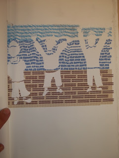
This is the final post I'm making for Graphic Design as of this semester. The images above are from the text project I've done. I was required to make a make by binding a group of pictures created exclusively out of text. The story I chose to portray was "Rime of the Ancient Mariner". I made the cover out of two slabs of words which I carved for the lettering. I made it jagged and rough to manifest how I think the mariner would have made the book if he wrote his story down. After carving it I shaded the arm and scenery with lead and graphite. I then sprayed it with fixative so it would not smear. The picture is of the mariner pointing to the Albatross in the sky. The pictures in the book are printed on rag paper. I used rag paper for it's durability and it's ruffled, uneven edges. I believe it gives the book a little character that way. The subjects are depicted like card board cutouts. I wanted to experiment with implied lines by differentiating the bodies of the subjects by letting the text go through the negative space. This way the figures would not look to vague, but I could still keep the cardboard cutout sort of design that I wanted. The results of this project meet some of my expectations, but I wish I had gone outside of the imaginary boarders I had created for myself when I made the pictures. I was unrelenting at going against the orderliness of the lines that framed my picture and I regret doing that. I also would have kept the gothic looking text that was originally in the pictures, but I could not because the typeface did not register on my version of Adobe Illustrator when I took the files home with me. This journey in Graphic Design has been an interesting learning experience. I definitely become more aware of the importance of typefaces and their applications. If anything, I should say that I'm in debt to the professor for all the insightful critiques I've received from him and I hope to do more classes like this again.


No comments:
Post a Comment